Search engines are full to the brim with vague articles repeating each other's talking points, and exception being this blog post by Matthew Ström: https://matthewstrom.com/writing/ui-density/
Image search is no better, with largely irrelevant results.
In the age when everything is spaced out and zoned out gray on gray, what are your go-to examples of UIs that pack a lot of info?
- https://superuser.com/questions/1117466/using-windows-perfor...
- https://github.com/wolfpld/tracy
- https://github.com/WerWolv/ImHex
3D modeling / CAD software:
- Blender/Rhino etc
- Similar for audio you can search for 'DAWs' (https://blog.landr.com/best-daw/)
Many examples on https://x.com/usgraphics/media only some software.
Not on the data side but can be useful just for contrast from todays software:
The idea is to sort products not by one parameter (like price or release date) but by two - which creates an x/y chart. The product info is displayed dynamically - by default only the image is show. On hover, more info is displayed in a tooltip. And when you click "details", all data is shown.
This way, 300 products easily fit on the screen.
You need to watch it on a monitor to see the chart interface. On mobile, I just display a normal list.
I have been working on Buckaroo, a table UI for dataframes that runs in jupyter notebooks. It's much more TraderUI, with sparkline size histograms, and decent baked in formatting for numeric columns.
E.g. pro desktop versions of photo, print, video, sound, etc editing software usually feature good UX and high information density.
One well known example of that is Blender - here is a chapter from their manual about its user interface: https://docs.blender.org/manual/en/latest/interface/window_s...
We used to have an even denser display, but they sadly got rid of it. It was the original reddit mobile interface (served as a webpage, not an app).
There is a screenshot on this blog post (by one of the guys who worked on it): https://pdx.su/blog/2023-04-06-rip-reddit-compact/
You should sign up for paper trading and see these UIs feel like.
Here is a blog post talking about the different ui elements http://nenadmilosevic.co/ableton-live-redesign/
I used it to build a merge conflict tool: https://codeinput.com and while it required a much deeper understanding than just reading the docs (tons of bugs), it is by far the most comprehensive UI framework out there. Most UIs either lack lots of components or are made by a couple front-end/react/css guys. This inevitably means that they lack research into things like typography, accessibility, patterns, etc..
It is an extremely well-designed and effective high-information density UI designed to be very efficient to use but requiring some skills to get the most out of it.
It has has one of (if not) the best tagging systems of any website and between the tags and search filters you can find anything you like.
Each page has a header with useful links, a list of tags to the left, and a grid of paginated images with basic stats on the rest of the page. Click an image and you get a bigger version of it with download options, all of the tags that apply to it specifically, and comments from users.
It's basically as good as it can be.
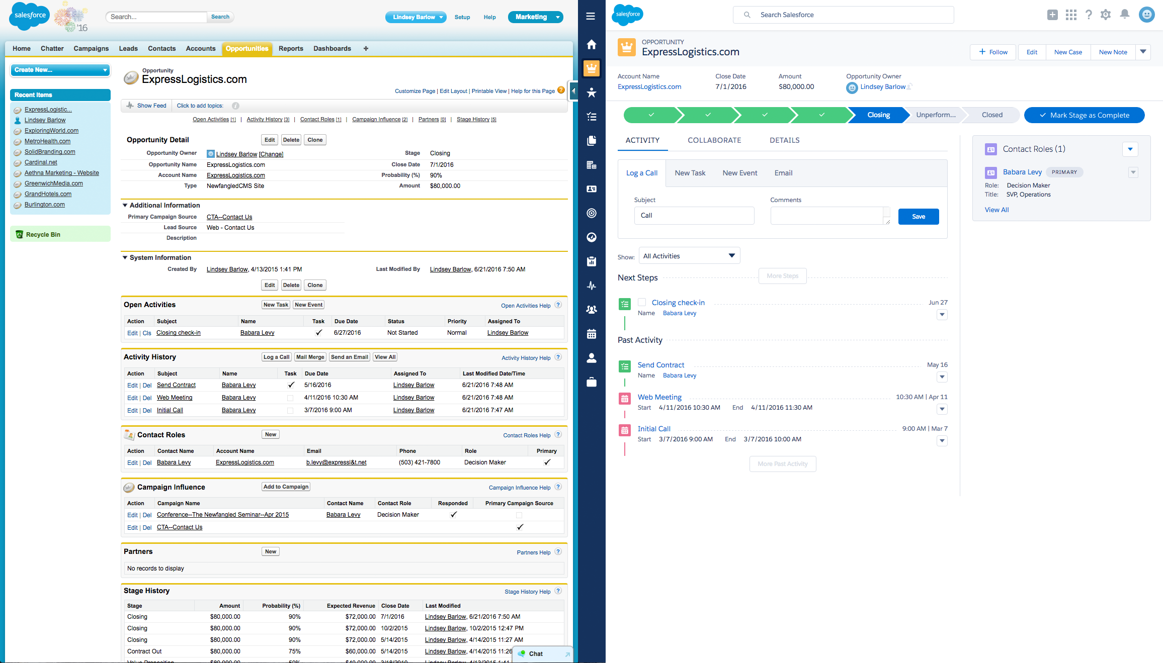
I worked there as a product designer for a couple of years, I now work on even more data dense UI in the cyber security domain, e.g. https://elastio.com/blog/cyber-recovery/three-clicks-to-rans...
As with almost all UI design the answer is "It Depends". If you could provide a little more context around the domain you're working in I'm sure I could point you at some specific examples
However, the books are old and specifically call out the low resolution computer displays at the time. Does anyone have an updated list of references for high density visual information?
Bret Victor's https://worrydream.com/MagicInk/ was a good starting point for me.
In one component you can see temp highs/lows, precipitation, cloud cover, humidity, wind speed, etc. by the hour, for the next week.
Full disclosure: I worked on this as a junior engineer, the lead engineer was fantastic. The code hasn't changed in 10+ years.
[0]https://www.wunderground.com/forecast/us/ca/san-francisco/37...
I haven't did a Show HN yet but I'd love to get some feedback on it first.
It's got a lot of configurable views and can be made extremely dense (dense mode on + columns: auto). The aesthetic itself was made to deviate as little from the HN frontpage as possible.
It's got a lot of filtering knick knacks like being able to view by top comments/points, view hn as a timeline of top stories by comments or stories or view hn by top n over day/week/month/year/custom.
I like the simple table view of RPiLocator. Only a few columns, but lots of rows, no unneeded clutter. https://rpilocator.com/
Not as compact as possible, but at least shows quite some information: GSMArena. It could fit more phones into the comparison table with less whitespace/greyspace though. https://www.gsmarena.com/compare.php3?idPhone1=10386&idPhone...
All sites as viewed on desktop, on mobile this would likely not work out.
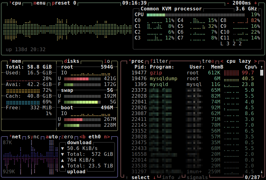
I also want to echo the command line tools mention in another comment. GDB's TUI is reasonable for my use, but after some experience this recently posted terminal debugger might be better: https://github.com/al13n321/nnd via https://news.ycombinator.com/item?id=43905185
Also the hex editor I am currently using, despite some problems: https://github.com/WerWolv/ImHex
An example of an information dense GUI that might be a bit overwhelming is Ghidra: https://en.wikipedia.org/wiki/Ghidra (page includes a basic screenshot, you can fill your screen(s) with as many sub windows and information panes as you want)
As a side note, while trying to find examples I realized just how few websites there are (any more?) that show a lot of information at the same time. Worst recent offender is YouTube's redesign with only 3 video tiles in a row on a 1440p screen, luckily easily fixed via a ublock rule.
"Pro" trading websites, for stocks or cryptocurrencies (e.g. Kraken and Coinbase have different interfaces for regular and "pro" users)
[0] https://www.researchgate.net/profile/Panagiotis-Zaharias/pub...
[1] https://mtthwx.com/wp-content/uploads/2018/11/wowow.jpg (silly example)
There's a myriad of other ones as well, they all have similar UIs, with the primary goals being to never hide any important info from the user, and to let the user take important actions quickly. That naturally leads to high density. Nevertheless it needs to be reasonably intuitive, since doctors and nurses tend to not be very tech-savvy, which leads to some interesting design constraints.
--
- Portmaster
Url: https://safing.io/
Screenshot: https://camo.githubusercontent.com/2f95620e28c8369cdcf94020e...
- UnigetUI https://www.marticliment.com/unigetui/#screenshots
- Mixxx https://mixxx.org/screenshots/
- VMware Workstation
Url: https://www.vmware.com/products/desktop-hypervisor/workstati...
Screenshot: https://blogs.vmware.com/wp-content/uploads/sites/42/2018/09...
- Pi-hole (scroll down for screenshots) https://pi-hole.net/
- The Movie Database https://www.themoviedb.org
- Steam https://store.steampowered.com/
- Mixx: https://mixxx.org/screenshots/
- darktable: https://www.darktable.org/about/screenshots/
Take mouser.com, digikey.com, grainger.com rockauto.com or mcmaster.com. They all have a bit of a "landing page" but once you go to search for parts you've got something that was really designed to be an intuitive parts search. Compare that with jameco.com which competes with mouser/digikey but has a more classic webshop search system. It’s a bit more frustrating to use.
Some news sites also do a great job of presenting headlines and highlights well in a small area. I think semafor.com is probably my current favorite, but I'll readily admit that it's not the most information dense.
CAD software also tends to be good at this, but that might be just because the UI has chugged along since the 90's. AutoCAD/Inventor/Solidworks/SolidEdge/KiCAD/Altium/Virtuoso are all great examples where if you've got prior experience with them (or even similar software) you can sit down and quickly get up to speed on a project and see what's been done. I think the distinction is that a lot of software/websites are designed to keep the average user focused on a single aspect and so they are designed to either remove or hide the complexity but for more “professional” level tools you need all that data and information. You can probably blame (for better or for worse) material UI for a lot of this spaced-out thing. In my mind that was the first mobile first UI scheme that really took off and it's basically influenced everything that's come sense then. Computer first software might be your best bet to get some examples. Because a lot of the web is mobile first/mobile forward now you probably aren't going to find a lot of examples on that. I would love to see examples of information dense mobile first sites.
A few other examples I just wanted to brain dump:
- labgopher.com
- tld-list.com
- The Bloomberg Terminal
- Ghidra
- Most plane cockpits, especially modern fighter planes if you ever get to see/sit on one.
- A lot of “professional level creative software” – Reaper, Affinity
- Train control and monitoring systems
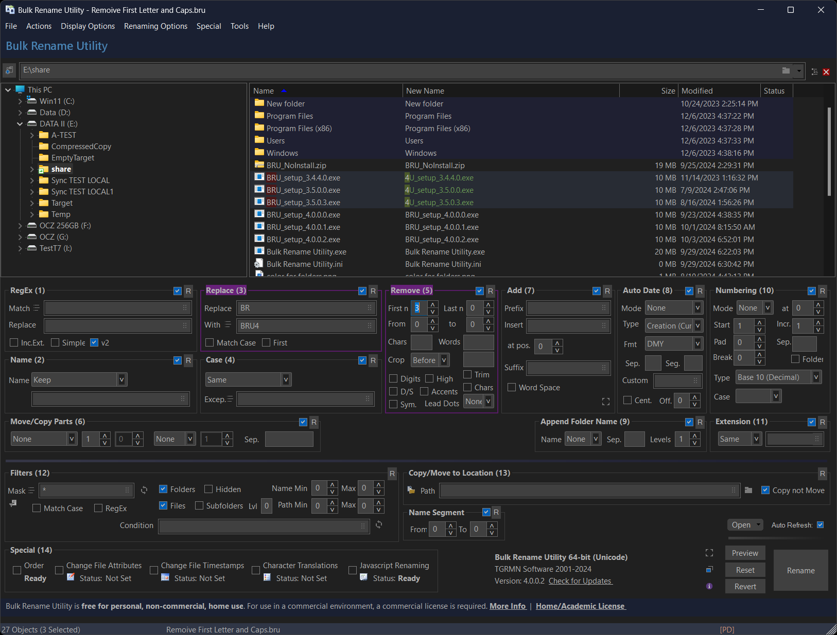
[1] https://www.bulkrenameutility.co.uk/assets/img-bru/darkmode....
[0] https://assets.bbhub.io/image/v1/resize?width=auto&type=webp...
Articles:
- Density and Audition: https://www.nngroup.com/articles/windows-8-disappointing-usa...
- Density is Cultural: https://www.nngroup.com/articles/china-website-complexity/
- Conventions: https://www.nngroup.com/articles/breaking-web-conventions/
- Information per cm² https://www.nngroup.com/articles/designing-effective-infogra...
Unfortunately I don't really know how to get screenshots or examples for you, given the nature of healthcare data privacy and such
But I would suggest searching around and seeing what you can find for clinic software. I bet you can turn something up
They have also been victimized by the designers wanting a ton of whitespace, but those are both spaces where the customers push back.
This one 3-1/8" inch instrument displays more than 15 pieces of information, is somehow perfectly legible even in turbulent flight, _and_ is more reliable and accurate than a whole 6-pack[1]. Synthetic vision unlock is only $500. This is all without switching different pages.
Get two of them, and the FAA considers the possiblities of both of them failing at the same time so low, that you can cover one of them to satisfy partial panel failures in a checkride - well, all you do is to switch the "working" one to the PFD page, and you haven't really lost any capabilities!
I made this UI for realtime ham radio signal spotting a couple of years ago, which was an interesting challenge in that regard: https://ft8.live
I used Ant Design and Deck.gl for this which are both quite good for building dense UIs and data visualisation platforms
[0]: https://www.native-instruments.com/en/products/komplete/synt...
An artist page: https://rateyourmusic.com/artist/stereolab
An album page: https://rateyourmusic.com/release/album/stereolab/dots-and-l...
I personally adore it - RYM is permanently open on my 3rd monitor throughout the work day as I churn through new music.
High density can and often is done wrong, but it is often the hallmark of interfaces for professional users, an intricate tool designed to be used as quick as passable for hours on end, to accomplish this you try and reduce intermediate steps. this means putting everything up front, redundant panels(to do the same thing from different viewpoints), no overlap(why obscure information?) etc.
The end product usually ends up being intimidating as hell for new users. But is much more ergonomic for experienced ones.
Redfin search: https://www.redfin.com/zipcode/94110 Redfin listing: https://www.redfin.com/CA/San-Francisco/3000-3006-26th-St-94...
(Figure-ground is how we perceive three-dimensionality in a 2D space.)
This is one of the best arguments for skeuomorphism I've read. It doesn't address the _look_ (ie, brushed metal) but it absolutely addresses the _style_ (looks like a real toggle switch, a real button, etc.)
In addition practically every Chinese app is extremely dense, look at Taobao, Meituan Waimai, Eleme, Alipay, Xianyu
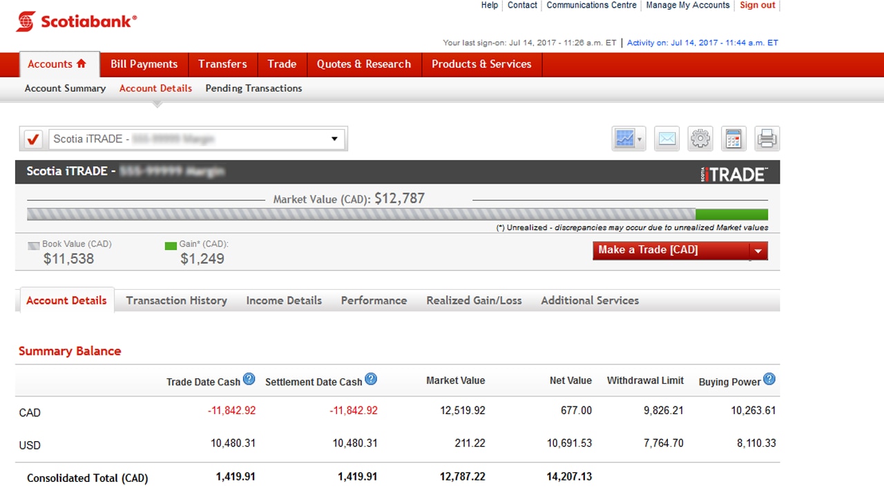
https://d33v4339jhl8k0.cloudfront.net/docs/assets/5be07d872c...
https://www.scotiaitrade.com/content/dam/slf/images/HowToAcc...
I have adhd searched for an image I have save of Classic Windows XP theme with cmd windows and old Firefox with old unknown web ui. Peak. But cant find it.
*Edit - I found it
This is the peak UI - LOOK. Just everything. Windows XP? with classic theme and some multi workspace swicther in the corner. Small icons, no combine taskbar. SSH/console. Classic Firefox. Unknown encoder web UI "BEAST". DENSE.
https://i.imgur.com/Sdy3Z5o.jpeg
This is also a collection
Adding Wireshark
https://i.imgur.com/VLSspTw.png
Adding Qbittorrent
https://preview.redd.it/0yukk4ligh5a1.jpg?width=1907&format=...
https://aviation.stackexchange.com/questions/16808/why-was-c...
imho the UI is the monitor, mouse and keyboard with the later two being the most important.
Also of interest here is the amount of conditioning the user enjoyed/suffered. If they cant get their things done elsewhere they will have to learn how to use the proverbial Blender. If the interface gradually got more complicated the long term user wont even notice how crowded it got.
If you put a form in front of someone with fields like name and address when they are requesting a quote you don't go put "personal info" at the top... in a red font?? If it is important you use a larger font, red is for drama. We have bullshit draining the attention.
The same goes for "Address correction", the user is not to stupid to see the form is returned to them.
It gets worse from there....
"We could not find the address you entered"
If it was an IRL person to person interaction this is all you would say. No screaming or drama required.
Some elaboration would be nice. If you do that properly there is no need to vaguely talk about the address in general.
"Entered street name was not found"
Imagine that, ask yourself, would it be useful to also say you couldn't find the address?
But we have stuff between those two things to further confuse the user. I don't know the situation but if they may continue despite not finding the address you should probably just accept the address.
It gets even worse from here... We've told them we cant find the street name but the house number is also incorrect??? wha how?
I haven't the slightest what "Directional incorrect" means, maybe and/or works differently in the US.
We don't know what St means in a street name?
If one may make changes or continue with the address provided. How will the user know his changes are correct? If they want to continue as~is they cant be presented with "Address correction" again. You would need two submit buttons.
And finally, the truly most terrible part is that the "errors(?)" are not described above or below the form field they apply to.
We get this wall of complicated text where a few lines should have been enough.
As this is page 1 out of 8 the odds people will run away from the computer screaming are greatly improved.
> What are good high-information density UIs (screenshots, apps, sites)?
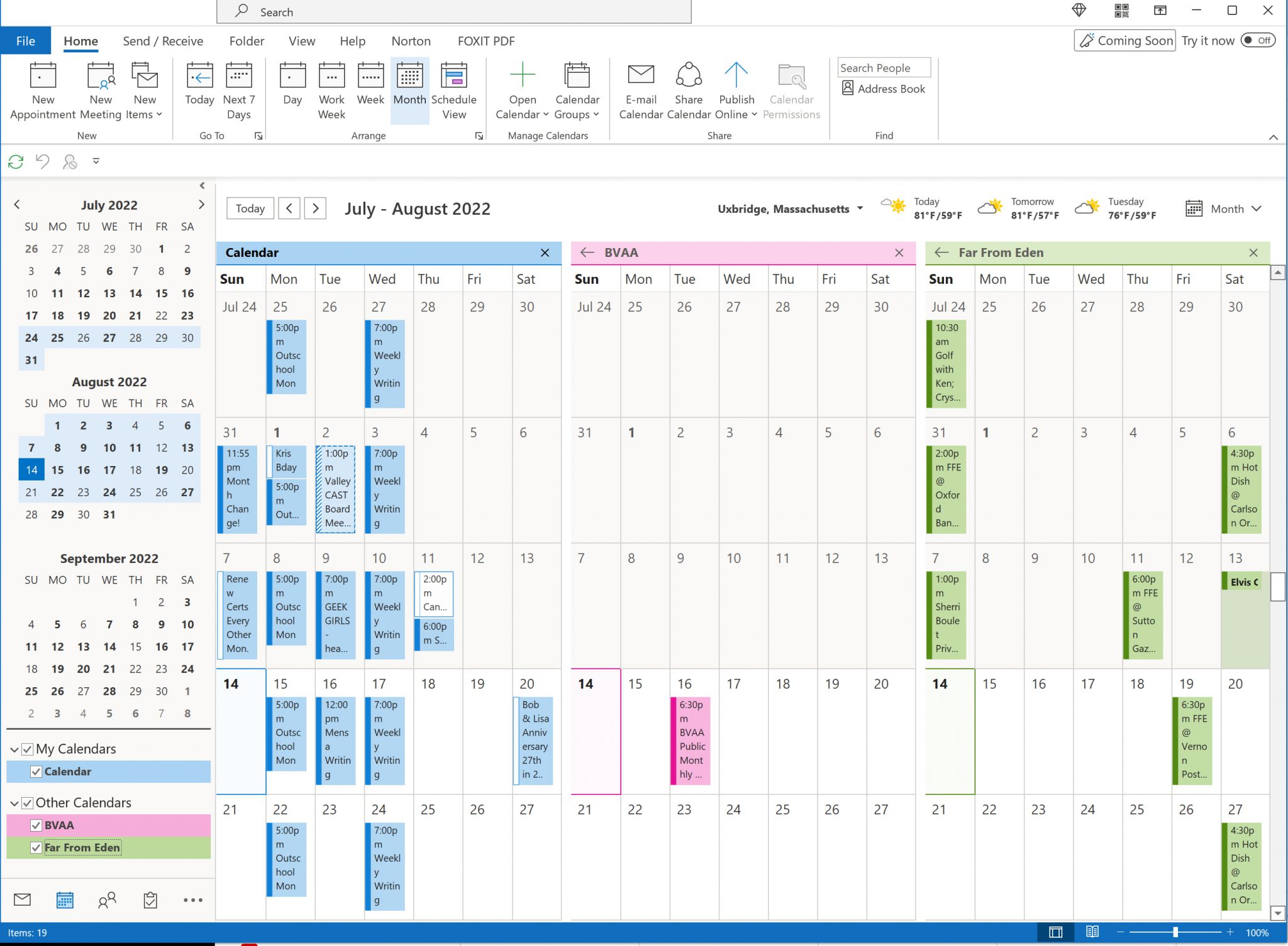
More: https://www.google.com/search?udm=2&q=outlook+calendar
After that Visual Studio while debugging. In general, I think graphical debuggers and profiling tools do a relatively good job of packing lots of information into many, small windows.
Something you'll find in both ableton and after effects are smart, adaptable panel abstractions/conventions. Both have fairly rigid application frames and large distinct sections where discrete types of work happen. But they also have panels where things can get nearly to a free for all. Think custom video effect controls, or individual midi instruments. There are norms (knobs look and work similarly), but things can get totally custom as well (custom graphs, etc). Lastly, at the very edge (~1% of use cases), there are ways to escape the constraints of UI entirely. AE has a code editor for things like custom wiggle animations. Ableton has M4L (which subsequently supports JS and possibly some C, IIRC). You can get yourself into trouble here in ways you normally couldn't: it's possible to straight up break things.
Greedy whitespace nonwithstanding, the most pernicious modern UI trend you'll need to buck is the idea that your UI should be simple because it is for simple people. Sometime UI is cluttered because of sloppy design or bad abstractions. Sometimes UI is cluttered because it's meant to empower people who think and care about multiple things simultaneously. Modern UI trends will tell you not to serve a man a steak because a baby can't chew it. Serve steak, babies be damned.
I guess that was mostly about functionality, and only adjacent to density. For actual density: vintage (2016ish?) 538 tables, vintage (pre 2010?) stockkeeping and cashier UI. These are basically TUIs with just a hair more polish. * Much less text heirarchy. This means even line heights, which means easy dense grid layouts. Achieve contrast with boldness rather than size, side borders, inverted backgrounds, etc. * The opposite extreme: very big items for very big tasks. Wide touch areas for each food item that a server can rapidfire tap through, everything else tucked to the side. * Thoughtful truncation: grid layouts often ask that things overflow. Do they elipsis at the end? Do they drop the middle? Do they condense 3 pieces of information into 3 smaller pieces of information? Etc. * Prefer text to icons for all buttons, menus, etc. A tab menu of just text is easy to parse. Icons add noise, and non-text buttons force users to speculate instead of read. * Intentionally non-responsive panels. Having fixed sizes for sidebars, panels, etc makes it easier to reason about how subcomponents snap to grid, and greatly shrinks the workload created by having to allow for fluid item reflow.
https://github.com/ocornut/imgui/issues?q=label%3Agallery
So you don't have to dig, 3 examples
https://camo.githubusercontent.com/6f62b5ca8579543a1f59eceed...
https://private-user-images.githubusercontent.com/13691253/4...
https://private-user-images.githubusercontent.com/14961870/4...
rockauto.com
Those demos run at 60fps (interactive) in the browser, but they recently started requiring google login to view them which is a shame.
(If you want information-dense designs, find someone who benefits from them, and ask them.)
You just described the modern search experience on any topic.
As much as I hate it, i'd suggest asking a few "AI"s and trying Kagi.
Back in the day, we sold accounting systems.
Now the beauty of accounting is that everyone needs accounting, the fundamentals are all quite solid and common, but even still, everyone does accounting differently. Matter of taste of the Controller, industry specific bits, etc. While everyone has a chart of accounts, no two chart of accounts are the same.
So, anyway, we ate our own dog food, we used our own accounting system in house for, you know, accounting stuff.
But the funny thing is that when you opened up the Accounts Receivable Invoice screen, and this is on an 80x25 color terminal, I would say it was 60%+ a collection of fields regarding the invoice. Customer, dates, terms, etc. Probably 20 fields on that screen, all crammed together, because real estate was always an issue on 80x25 terminals.
But, we were a simple business, and the bulk of those fields are optional for specific use cases, and those options are based on the customer.
So, when you entered in the customer for the invoice, 80% of the fields just vanished from the screen. Feature of the system. But it made a very busy screen into something quite stark. It doesn't resize, it just makes the field go away. The top half of the screen was, essentially, blank.
I always found it amusing to see all of that information vanish.
It's extremely dense, but not very good
Much of the low-density trend can be traced back to Tailwind. I love the library, but I do find it frustrating that pretty much all designers lean towards low-density by default.
The problem is that it only works well for casual/consumer applications. Once you start building for professional, productivity-driven products, you need density.
One shining example I can think of is: https://usgraphics.com/
* Deluge Torrent Client
* Gimp before they changed the toolbox icons
* InkScape
* Blender
* Bless (Merge tool)
* htop
Audio DAW or video production apps jam tiny buttons and indicators all over the place. A mixing console is the epitome of this. Shit, the cockpit of a plane. AutoCAD. Stock trading apps. These aren’t great in the web UI sense - the pattern that emerges is that dense UIs are for experts or people who dedicate a lot of time to learning the UI and appreciate the long-term efficiency that short term inefficient brings.
<https://toot.cat/@dredmorbius/114356066459105122> and <https://diaspora.glasswings.com/posts/e919db600cb8013eb7b844...> show screenshots and describe the interface.
It's a locally-hosted, personal system, updated manually via shell scripts. The prototype is based off of CNN's "lite" headlines page (<https://lite.cnn.com/>), which presents 100 headlines in an unorganised fashion without context.
My first cut simply organised the headlines by section and date. The version linked above includes several lede 'graphs for each article, along with some other formatting. It runs about 15 or so screens on either my desktop or mobile (large-format tablet) devices.
I'm looking at extending the concept to other / additional news sources, largely as CNN's article offerings are disappointingly irrelevant. (Discussed in the Diaspora* thread.)
Features I'm thinking of adding include:
- Bayesian ordering by significance. (This will be based on my own article judgements used as training data.)
- A "best of the interval" capability.
- Adding in articles from several alternative sources. The Guardian will likely be the baseline given its well-structured nature, reasonably comprehensive news, and lack of a paywall. There are likely a few other sources I'll add. I'd like to include weather and perhaps some business ticker data as well. I've had previous ideas about a "news dashboard" which tracks significant indicators, and would like to try applying several of those concepts, if my coding chops are up to it.
- Possibly a bit of visual flash, though from what I'm observing, virtually all graphics used on news sites are more distraction than value.
- Incorporating eInk-Mode: <https://news.ycombinator.com/item?id=43690828>
very old and not optimized for modern screens, but the density always was impressive to me
especially the opcode tables
With some exceptions and edge cases (like trading or aviation where you have to see a lot of information at once, density is the product in itself) I argue that by "good" UI most UI users really mean "well structured and carefully prioritized information that doesn't overwhelm you" (aka "low information density").
It is really hard to find good UI in that sense. Apple is doing okay job in their iOS and macOS UI in general. Modern car makers (some of them at least) reached a pretty good point when a lot of complexity is hidden behind a very intuitive UI.
Btw, Apple was expected to be good at UIs because of its history of _inheriting_ xerox's military UI research achievements.